Have you ever come across a site that made you want to buy something? That may be a slight exaggeration, but you know what that’s like. Some eCommerce sites are just so engaging, visually appealing, or otherwise relatable that it’s almost a joy to participate by spending money with them. While there isn’t exactly a magic formula for this, it’s still possible to identify websites that really get it right.
The common factor with these sites is that they’re crafted by web designers to not only sell products but to communicate the aesthetic of the brand. Competent web designers, by the way, don’t just build WordPress eCommerce sites; they also help maintain them by keeping up with trends, offering WordPress emergency support, and more. Web design services and website maintenance companies are examples of this type of all-around website support, and they’re an invaluable resource for any eCommerce site that wants to offer the best possible user experience.
What’s so special about WordPress, though – aren’t there a hundred other ways to host and publish a site? Sure, but WordPress offers more ready-made potential for genuinely cool eCommerce sites. There’s plenty to be said for websites that are cleverly designed to “guide” users towards committing to a purchase, but before that can happen, it really helps if they like you in the first place. And how do they start to like your brand? When they love what they see on your website.
1. Lost Dog Cafe
Many of this year’s popular web designs favor a simpler look, but Lost Dog Cafe is bucking the trend with its colorful website. You can check out the menu, place an order, or even find out which beers each location has on tap. Located in Binghamton, NY, this eatery matches its roots with an almost bohemian use of color and layout.
2. Earth Sense Energy Systems
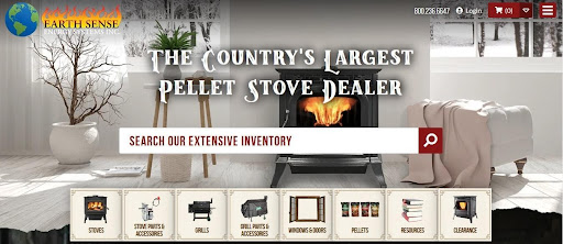
What makes you want to get cozy in front of a fire? Feeling cold, of course. Earth Sense Energy System’s landing page isn’t full of warm fires; it looks almost like a winter landscape. But wait! There’s an old-fashioned stove right there in the middle of the home page, calling to anyone who wants to get warm. An unassuming banner at the bottom of the screen makes it easy to see what your options are while scrolling down a bit will give you more details on their various product lines. That first impression sticks with you, though, even as you browse grilling accessories or the clearance section.
3. Shop Catalog
Associated with the youth culture website Thought Catalog, this WordPress eCommerce site feels both youthful and mature. The products take themselves seriously, but not too seriously; a sprinkling of emojis keeps everything light-hearted. The backgrounds are mostly neutral, but the brightly colored items in the online store make an impression. The layout matches the overall theme too; some of it follows a grid pattern, but a few sections are less structured to avoid the impression of formality.
4. Offerman Wood Shop
Nick Offerman may be more famous as an actor than as a craftsman, but anyone who takes a look at this website will see that he spends his time well whether he’s filming or not. The high-end furniture is matched by the website – it’s bold, assertive, and often pretty big. The product photos are laid out to let the furniture tell its own story, and since most of them are photographed as if they’re already part of a real home, it’s easy to picture exactly how you’d use them yourself.
5. House of Whisky Scotland
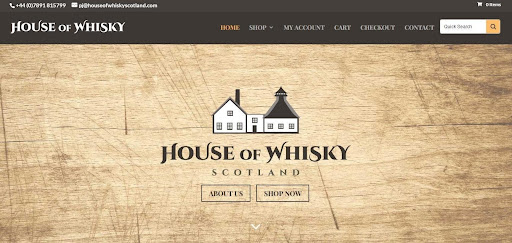
When you hear “minimalist web design”, you probably don’t think of a well-used wood background – but that’s what you get with the House of Whisky Scotland website. Your eyes are drawn to the logo, and then to the two buttons just below it. They might not be anything special by themselves, but that simple wooden board creates a sense of authenticity and history that makes you feel like you’re participating in something special. Even the shopping experience has something extra to offer – choose your whisky by year for birthday or anniversary gifts, or simply explore how a certain line of whisky has evolved over time.
6. Björk
You probably already knew to expect something unusual as soon as you saw the name. Björk isn’t at all ordinary, and neither is her website. Gradients aren’t that uncommon for home page designs, but the colors create quite an impression considering how minimalist the actual content of the page is.
7. Airstream
How do travel and outdoor retailers get people to make a purchase? It isn’t simply by offering high-quality or useful items; it’s by romanticizing their products with backgrounds of epic mountain hikes, picturesque beaches, or majestic waterfalls. The viewer should see a picture of hiking boots being used on an adventure and think “I want to do that too”. Airstream obviously has a handle on this concept, as their trailer and coaches are shown to full effect in front of the natural beauty of scenic locations.
8. Flwr
Floral arrangements are already supposed to be beautiful, so how can you add to that without taking away from the bouquet itself? According to Flwr, a New Zealand-based online floral store, you let the colors do the talking – but not all of the talking. The lavish arrangements are held by models standing in front of a dark background, and the combination of bright flowers, understated clothing, and a contrasting backdrop sets the flowers off to full effect. The minimalist grid layout keeps the focus on the bouquets, but if you want to learn more about the arrangements, simply hover your pointer over any photo to get the details.
What do these WordPress eCommerce sites tell us?
They may follow a lot of the latest trends in web design, but they still have the substance and style to make a lasting impression. The key is to create an eCommerce site that perfectly expresses your brand, then let viewers see for themselves what you’re all about.


